Project Overview
Background
The 20+ year long State Highway 45 Southwest (45SW) project was finally coming to completion and the firms responsible for the project were looking for an interactive way to educate the local population about the sustainable building approaches used in the projects construction.
Objectives
The firms had already decided to go with the VR/AR agency Chocolate Milk & Donuts. They then decided to bring me on to help create their vision for an interactive Augmented Reality Solution for the Trail.
Scope
Augmented Reality Mobile App
Tools
Adobe Xd
Role
UI Designer, UX Designer
Duration
4 Months
Design Process
Discovery
Design
Testing
Iteration
Discovery
Conditions
The engineering firm already established trail stops with educational installations, all with markers that could be used for Augmented Reality scanning triggers.
Assumptions
- As this trail is a full ADA compliant trail, the people using it could range in age, accessibility needs, and fitness levels.
- Trail is not connected to wider trail system, most people will be driving and parking at one end of the trail
Research
User interviews on the trail and similar trails helped us gather information about what kind of experience people had with VR/AR apps, and what sort of apps they use in the outdoors, as well as some demographic information.
- 60% of trail users were families
- 20% Cyclist/Bikers
- 20% Individuals
- Snapchat and Amazons AR Apps were some of the apps people were familiar with
- My Fitness Pal was another app people were using often
Design
Low Fidelity Designs
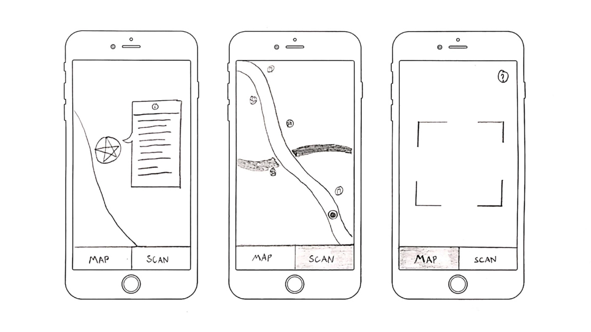
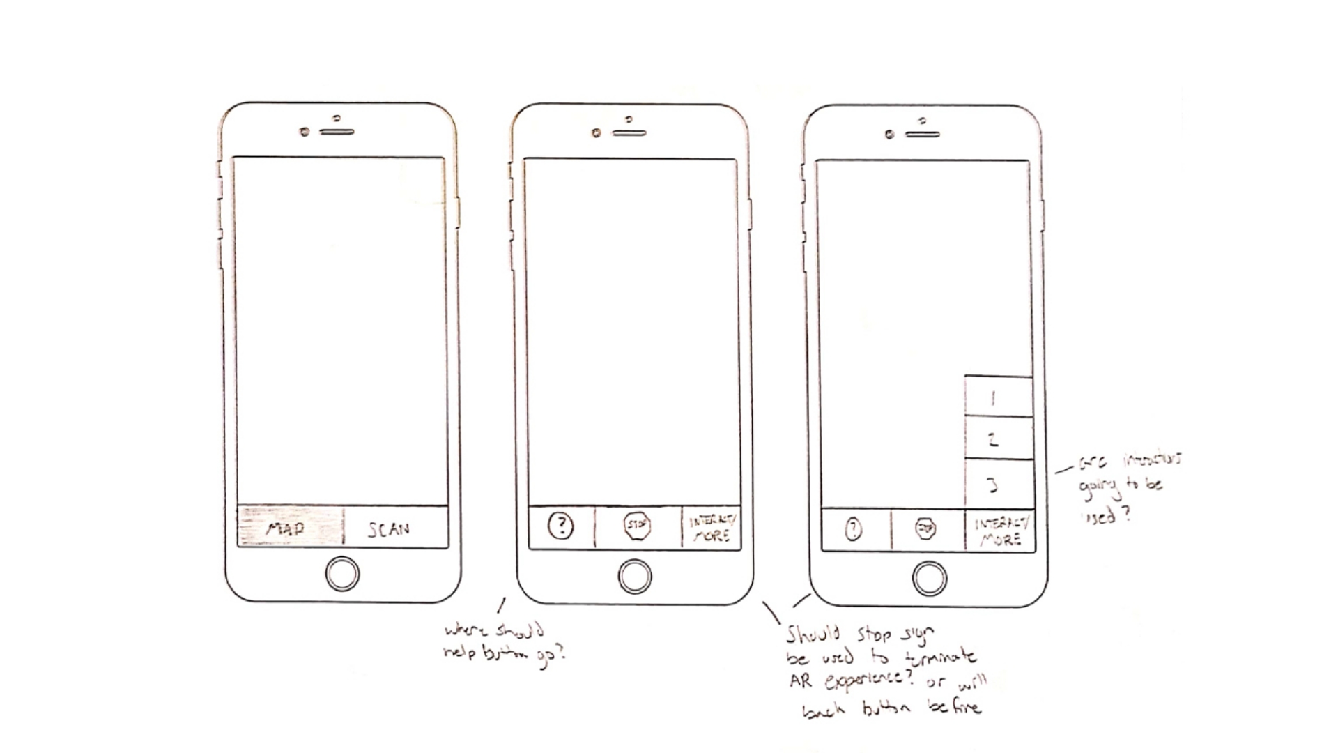
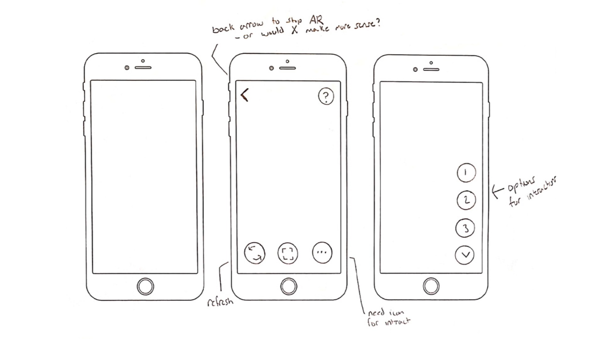
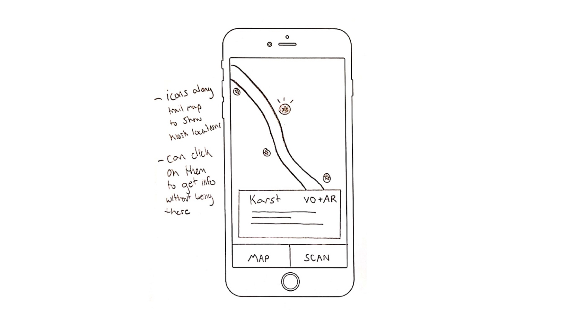
After gathering research, I went ahead and created some basic designs so that way I could visualize what the UI would look like and get some of the flows worked out.
App Flow Diagram
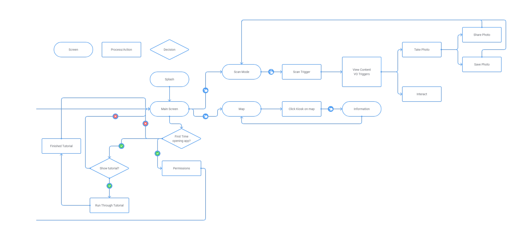
I worked out an app flow to share with the devs to guide them during their initial prototype creation
Prototype Mockup
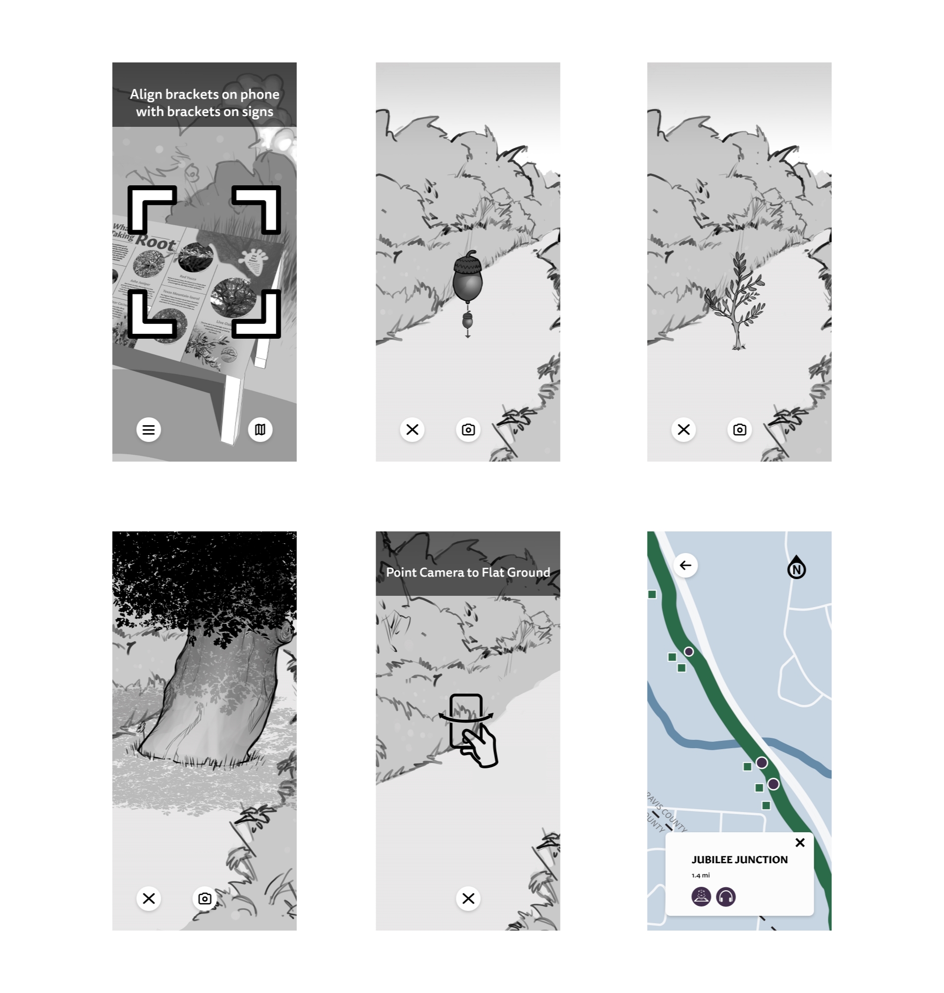
After the team was on the same page about the direction we were going to go forward in, I created a prototype in Adobe Xd with the help of a storyboard artist. This would help us visualize more clearly the steps the app would take. The storyboards also help us do some very basic user testing to see if we could identify any issues early on.
Testing
Developer Prototype
Since this is an Augmented Reality app, we had no tools at the time to do quick tests with users with the actual Augmented Reality Parts of the app. So I handed off the Adobe Xd Prototype to the Devs and they got to work on a version we could use to at least test 1-2 interactions with people out on the trail.
Solution
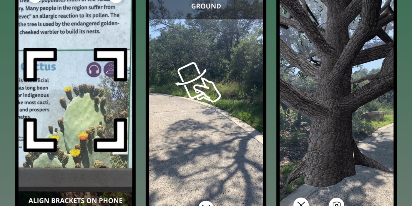
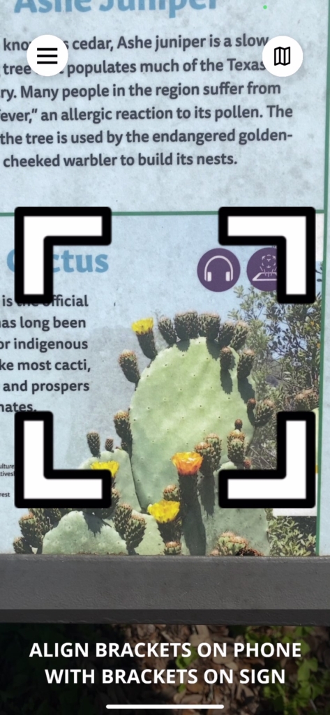
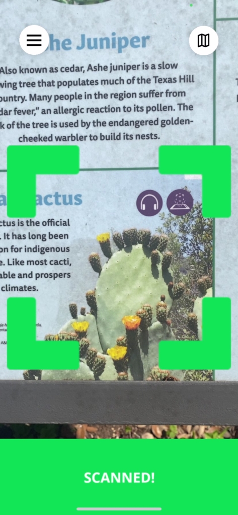
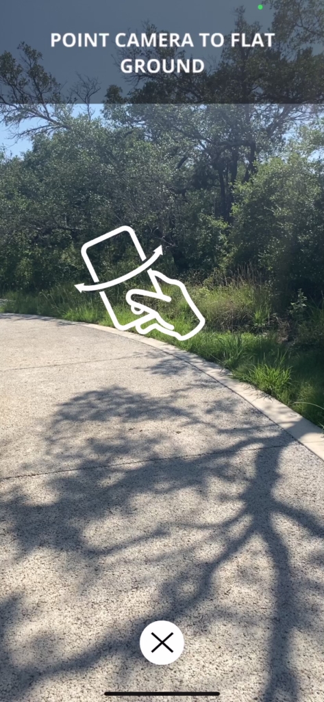
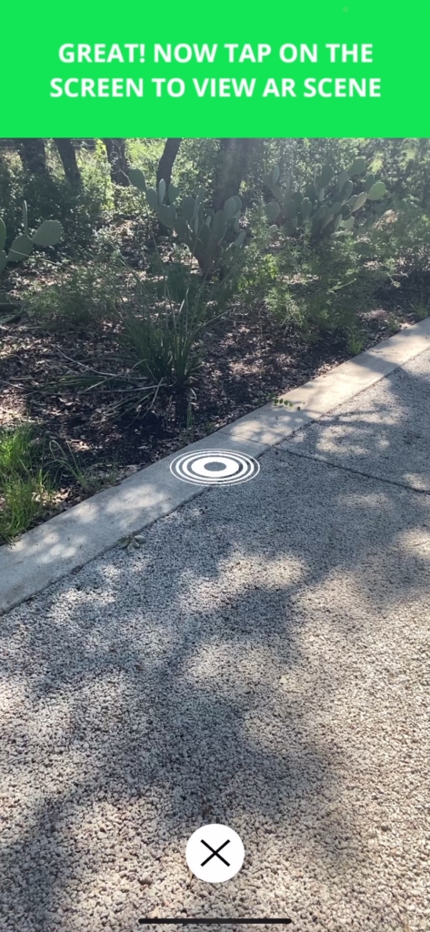
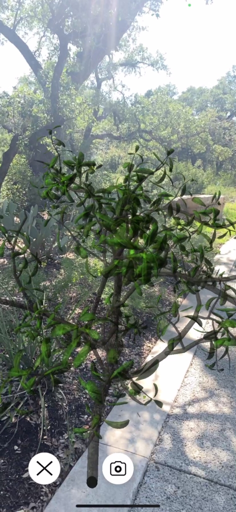
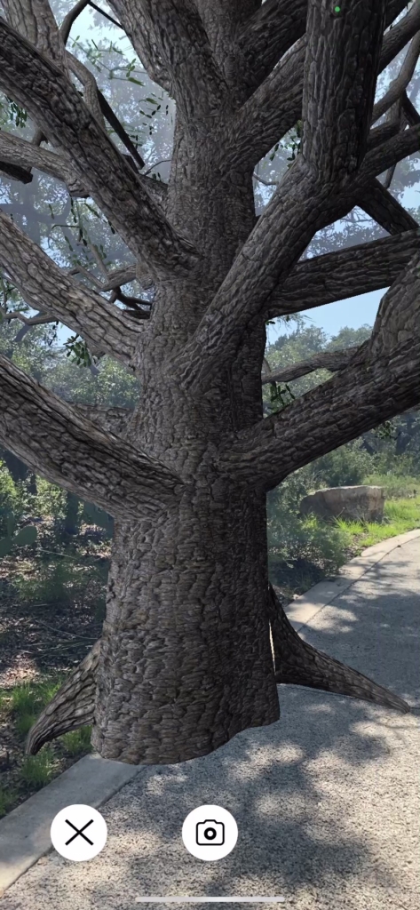
This is one of the main flows you can see, scanning a sign on the trail, placing the scene and listening to the narration.
Outcome
CTRMA decided to come back to us for a 2nd rendition of the app for the highway 183 trail in east Austin.
5 star ratings on the App Store and Google Play Store.
Steady month over month user growth.
